Musings on Batmanhttps://paullevitz.com/wp-content/themes/movedo/images/empty/thumbnail.jpg150150Paul LevitzPaul Levitzhttps://secure.gravatar.com/avatar/3441921179aff1838c01342fc1c9a68ba940f4f1a233065e2f21854c3c715b4a?s=96&d=mm&r=g
There’s a new volume out updating an older collection of essays about Batman: MANY MORE LIVES OF BATMAN, edited by Roberta Pearson, William Uricchio and Will Booker (2016, British Film Institute). I’m pleased to say the lead essay is a piece of mine, “Man, Myth and Cultural Icon,” exploring why I think Batman has been the most protean of the great comic book heroes. He’s been successful (and perceived as ‘true’) in incarnations as different as the role played by Adam West and Christian Bale, as well as so many interesting comics incarnations. There are interesting essays by the editors and folks like Henry Jenkins, one of the academic founders of ‘transmedia’ as a subject. Check it out if you get a chance.
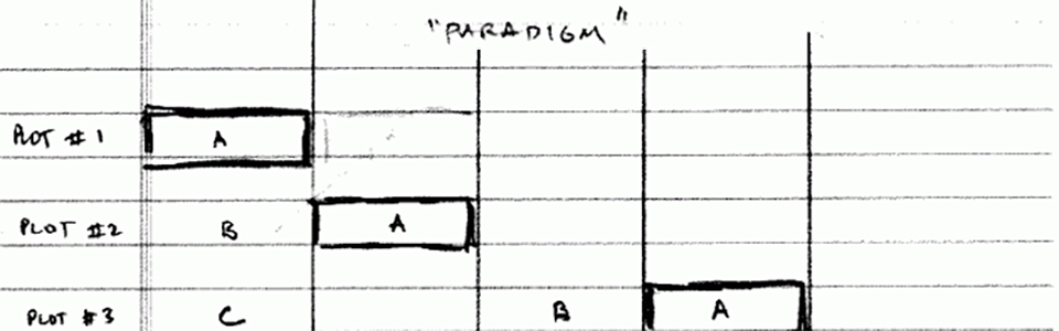
There’s been a bit of conversation lately about something Denny O’Neil kindly labeled “the Levitz paradigm” – a plotting tool I used in the Legion’s heyday to keep track of the many fluid plots and subplots. The physical ‘device’ is pretty simple, and the theory is one that was rapidly evolving in super hero comics in the ‘80s but which has deep roots in soap opera. Warren Ellis said some nice things about it recently online, and I wanted to both point out its prior ancestry and my modest contributions.
Today the terms “A plot” and “B plot” are conversational language, but in the ‘80s that wasn’t the case. Stan Lee and Roy Thomas had been developing the tools in comics since about 1965, and Robert Altman had been weaving it in films, but it hit the broadest mass culture when it moved to network prime time with HILL STREET BLUES.
If the ‘paradigm’ was anything beyond a charting tool, it was a few (sometimes ignored by me, sadly) guidelines:
start your secondary plots low and raise them slowly (maybe as a C or D plot before it gets to be a B, much less an A).
every time you visit a plotline, it needs to progress in that visit (if it’s boy meets sheep, one of them should end the scene in an emotional moment, for example).
vary the number of beats before you escalate to an A.
And all of this is, of course, secondary to basic plotting rules like making stakes important to the characters, and flowing plots from the characters themselves. Or one that I’ve grown fonder of in my recent years of teaching, that what reveals/defines character is choices, particularly choices with costs.
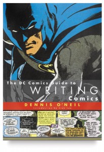
It’s a fairly simple and useful charting tool for doing serial comics, and if you’re curious to look at it, check out Denny’s DC Guide to Writing Comics.
Working on balloon-placing DR FATE today, and enjoying the careful detail that Sonny has used in researching a city so far from his home. It’s been fun writing art directions that include Google images, and even directions of flight over the city, and seeing what Sonny turns them into.
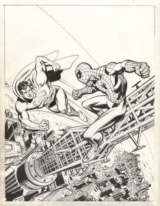
Looking at the scene in this issue set on the Manhattan Bridge walkway reminded me of the wonderful work of Ross Andru. Ross was a sweet man, and utterly dedicated to his art. I knew him from the time we worked on the first SUPERMAN VS. SPIDER-MAN tabloid to his period as a DC editor, when he was just down the hall. In his SPIDER-MAN days, Ross wanted to get his New York scenes just right, and would go up on the rooftops of Manhattan’s buildings with his camera, taking reference shots so he could get Spidey’s perspective. It’s probably impossible to do that in these post 9-11 days, but back in the ’70s, Ross got access to building after building.
His art always had clear storytelling (I was a fan of his work on the early issues of METAL MEN before I knew to pay attention to credits, or even thought about the fact that actual people created comics), but his work in the ’70s is a great textbook both for storytelling and clear composition of a page. I still send artists back to that work to look at how the line structure of panels can add to one another to make a page more dynamic. (It’s a hard concept to describe without picking up a pencil to mark up the pages, but think about the similarity of Ross’ work to Walt Simonson, or Gil Kane, or Jose Luis Garcia Lopez in their starkly clear compositions, and you may see it.)
One of the occasionally contentious and often confusing questions in comics is the nature of the collaboration between writers and artists. Leaving aside the grand debates about Stan’s work with Jack and Steve since all three are or were friends, even in the much more modest cases there’s often no clear cut boundaries that are consistent from situation to situation.
So when I’m working with an artist in a true collaboration, inviting them to participate in the direction of the story and its structure, I’ve often adopted the practice of jointly asking us to be credited as “storytellers.” This last month’s issues provide some interesting examples of that, which I thought I’d share.
DOCTOR FATE #7 was a particularly challenging (and therefore particularly delightful) art task–largely inventing a view of the Duat, the Egyptian underworld. Unlike the Greek/Roman land of the dead, it’s largely unknown to modern readers, and didn’t have a long tradition of being depicted in Western art. Some depictions survive from when it was an active religion rather than a historic mythology, but not much. So Sonny had a lot to do in bringing the dead to life, and he did it in incredibly well. I got a book of Egyptian mythological art from Columbia’s library, ordered a dupe for him and shipped it off to Singapore, and we went to work.
But he also contributed to the story structure. The way I’d set up the final battle didn’t choreograph particularly well for him–how Thoth’s staff merged with Khalid’s DNA and the bouncing around of Khalid’s heart didn’t make a clear visual story. So Sonny built out an alternative choreography, and I adjusted the copy a little to fit.
BROOKLYN BLOOD premiered this month too, and because of geography, this represented a different kind of collaborative opportunity. Tim Hamilton and I were able to get together a couple of times to flesh out the story as it will evolve over its 15 or so chapters, and he’s been able to make suggestions based on the years he’s been living in Brooklyn of specific locales in addition to the ones I called from my old days in Brooklyn or more recent visits.
I’ve been incredibly lucky in my collaborators over the years, and while some of the great artists had no desire to get involved beyond their officially appointed tasks, it’s great fun to play with those who do. And of course, some of the artist who’ve drawn my stories are also brilliant writers too (I knew Keith should be writing comics long before he started to…).
It’s been a delight to get to know Jules while working on my new Eisner book, and to do a couple of convention events with him talking about Will, Jules’ own recent graphic novel efforts, and the world of noir. Right now I’m re-reading his memoir, BACKING INTO FORWARD, making notes for our upcoming conversation at the SVA Theatre next Wednesday.
He’s arguably the most diversely accomplished creative person to work in comics in America, at least if you judge by the shelf of awards, and I’m very curious to see if he can articulate a theory of why comics are such an appealing medium for us to work in. And we’ll talk a lot about Will, and some of my pet theories about Will that are embodied in the book. But if you have thoughts about good areas of discussion, comments please!!
Question from over on FBhttps://paullevitz.com/wp-content/uploads/2015/12/journaling-B.jpg300200Paul LevitzPaul Levitzhttps://secure.gravatar.com/avatar/3441921179aff1838c01342fc1c9a68ba940f4f1a233065e2f21854c3c715b4a?s=96&d=mm&r=g
Jamie Reigle asked me about how the FAMOUS FIRST EDITION of ACTION was done, and wondered if there had been any original art at all, since the story was cannibalized from Jerry & Joe’s newspaper strip pitch:
The technique to do the Golden Age reprints in the 1960s and 1970s started with a photographic process. A file copy of ACTION #1 was indeed cut up, then shot to create photostats the size of 10 x 15 original artwork that had virtually all of the color ‘dropped out.’ These stats had many imperfections in their lifework from the process, and occasional grey areas from the color. Young production artists were given the job of cleaning them up, freelance.
Many of my generation worked on them. I’m not sure who did ACTION #1, but some of the better ‘retouchers’ were Dave Manak, Steve Mitchell and Carl Gafford. During the 100 page giant era, when lots of these pages were being done, the work was often done in groups, and even non-art folks like me picked up rapidographs and joined in.
As for the original art, the cut panels were part of the art, but there was significant art extension and alteration to fit the format. Three folks claimed credit for that work to me over the years: Frank Shuster (Joe’s brother who lettered some of his early stories), Harry Lampert (who went on to draw the first Flash stories) and Sol Harrison (longtime DC production ace and early color separator). Never heard Joe’s version of these events.
With the Eisner book entering the publishing/marketing phase (a significant time consumer, but not a major intellectual challenge for the writer), I’m starting to think seriously about my next large project. Both the Taschen DC History program and the Eisner book partially came to me, so I’ve not yet had the experience of really hawking a new book from scratch. I’ve had one YA fantasy project kicking around for a while (translation: sitting on my desktop with a handful of words attached), and there’s a popular culture book I’d like to do which would require a fair amount of research. And the only idea I’ve pushed away has been a memoir per se–it just feels too early and too final, if you know what I mean by that contradiction.
Suggestions could get posted in the comments section if anyone’s inclined. After four decades as a writer who got assignments, this much of a blank page is a lot more challenging than I’m used to.
A Moment or Two With Murphyhttps://paullevitz.com/wp-content/themes/movedo/images/empty/thumbnail.jpg150150Paul LevitzPaul Levitzhttps://secure.gravatar.com/avatar/3441921179aff1838c01342fc1c9a68ba940f4f1a233065e2f21854c3c715b4a?s=96&d=mm&r=g
In honor of his passing, recalling a small moment that showed the length of Murphy Anderson’s career. We were walking back from lunch, and as we approached 1700 Broadway, Murphy smiled, and told me it had been on the very same site that he had gotten his first assignments from Fiction House, many decades before. Apparently that spot at 53rd and Broadway was magnetic for comic book publishers (not to mention the Beatles, Ed Sullivan, Letterman and Colbert across the street)…
Another nice memory is the last time I saw him. I’d been invited to a 40th anniversary celebration for MS. MAGAZINE, down at City Hall where they were going to receive a proclamation. I called his son, and convinced him to bring Murphy along. Got to watch Gloria Steinem giving Murphy the biggest hug in front of a giant blow-up of Murphy’s famous cover for #1. A nice capstone memory…
Murphy Anderson’s deep voice and sweet Southern charm were as smooth as his beautiful brush line. Dependably excellent at everything he did, he was one of the first people to enter comics loving the medium. Carrying his portfolio to Fiction House in the war years, graduating to a definitive Buck Rogers run in peacetime, and then moving to DC Comics.
At DC he became one of the standard-setters: creating the visuals for CAPT COMET, which some have argued was the first super-hero of the Silver Age; contributing to almost 600 covers over a 40 year span, many as penciller and inker; creating visuals for characters from the Atomic Knights to Zatanna, and virtually every letter in between; helping change the whole field by leading the charge to shift to a smaller original art size in the 60s and better color separations in the 80s; and becoming one of the handful of people who defined the DC “look” for the Silver Age of comics. His powerful Wonder Woman was the image on MS. MAGAZINE #1, making a statement that forever aligned that character with the feminist cause.
Murphy did fewer comics in his years producing PS MAGAZINE, but never lost his love of his field, his eyes twinkling when he talked about Lou Fine’s art, or recalled working with Will Eisner on the Army publication. He looked for any opportunity to be part of the comics world, and each time he was, a part of him was again a kid, biking across the hills of the Carolinas to find the comics he loved.
The family requests donations to the Heroi Initiative in lieu of flowers.
A very small book that you probably couldn’t get hold of, but should: TALES FROM A TINY ROOM by Wayne Ree. Delightful very, very short stories contemplating the peculiarities of the universe. And if the universe was created a god’s bad day, while walking in Bloomsbury Park, it might explain a lot…