Working on balloon-placing DR FATE today, and enjoying the careful detail that Sonny has used in researching a city so far from his home. It’s been fun writing art directions that include Google images, and even directions of flight over the city, and seeing what Sonny turns them into.
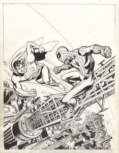
 Looking at the scene in this issue set on the Manhattan Bridge walkway reminded me of the wonderful work of Ross Andru. Ross was a sweet man, and utterly dedicated to his art. I knew him from the time we worked on the first SUPERMAN VS. SPIDER-MAN tabloid to his period as a DC editor, when he was just down the hall. In his SPIDER-MAN days, Ross wanted to get his New York scenes just right, and would go up on the rooftops of Manhattan’s buildings with his camera, taking reference shots so he could get Spidey’s perspective. It’s probably impossible to do that in these post 9-11 days, but back in the ’70s, Ross got access to building after building.
His art always had clear storytelling (I was a fan of his work on the early issues of METAL MEN before I knew to pay attention to credits, or even thought about the fact that actual people created comics), but his work in the ’70s is a great textbook both for storytelling and clear composition of a page. I still send artists back to that work to look at how the line structure of panels can add to one another to make a page more dynamic. (It’s a hard concept to describe without picking up a pencil to mark up the pages, but think about the similarity of Ross’ work to Walt Simonson, or Gil Kane, or Jose Luis Garcia Lopez in their starkly clear compositions, and you may see it.)
